Climate Change In Perspective
If you’ve been living under a rock, then you probably haven’t heard of the (now famous) “hockey stick graph.”
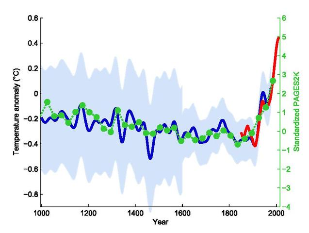
‘Hockey Stick’ was coined by the climatologist Jerry Mahlman, to describe the pattern shown by the Mann, Bradley & Hughes (MBH99) reconstruction, creating a graph that is relatively flat with a downward trend to 1900 which looks like an ice hockey stick’s “shaft” followed by a sharp, steady increase corresponding to the “blade” portion. The hockey stick graphs have featured in the IPCC reports as evidence of Anthropogenic Global Warming, or AGW.
Note that the time frame of this graph is for 1000 years. That’s barely the blink of an eye in terms of the Earth’s 4.5 billion year existence. Also note that everything prior to 1855, the start point of the red line in the graph above, is not actual direct measurement of temperature, but inferred by proxy.
Greenland Ice Core Proxies
The compacted snow in Greenland Ice Cores above the 1855 level is too recent and not compacted enough to be usable in ice core proxies. But everything prior to that is usable, and goes back nearly 52,000 years. Greenland ice core data doesn’t go back any farther than that. Temperature estimates are determined by analysing the ratio of Heavy Oxygen and Heavy Hydrogen to normal O and H in the samples of ice.
“Oxygen and hydrogen isotopes in the ice are analyzed to determine hemispheric temperatures because heavy water (water with deuterium instead of 1H), as well as heavy oxygen water, (water with 18O instead of 16O), have higher boiling points than regular water, and more heavy water gets into the atmosphere when global temperatures are high. The warmer the earth, the more heavy isotopes wind up in the ice. This has nothing to do with the temperature of the ice, it has to do with the temperatures at the evaporation sites.” [The evaporation sites from which the ice originated, which for this hockey stick graph are primarily from locations all over the Northern Hemisphere.] – scroll down to ‘Modern Warming’ at this link for a more detailed explanation of Greenland Ice Core Proxy derivations.
The Hockey Stick In Context
If you were startled or alarmed at the original Hockey Stick graph above then you may be even more shocked at what I will show you now! The graphs below will show you this ‘hockey stick’ in a proper context to human and geological history:
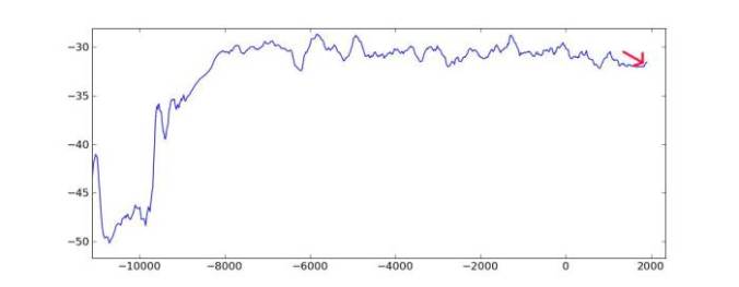
Original Hockey Stick (proxy data of Temperature) Graph 1 – 1400AD to 1855AD
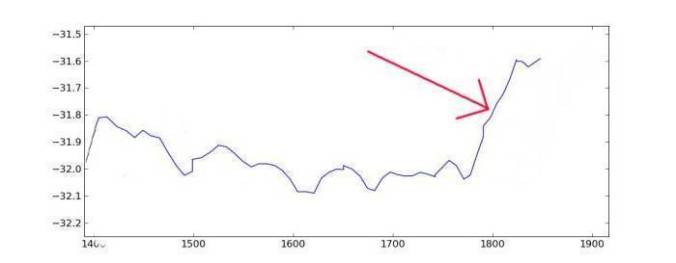
The Red arrow points to the blade of the ‘stick.’ The ‘blade’ starts at about 1780. Coal was only just beginning to be used in industrial applications: it was 1781 when James Watt patented his first continuous motion steam engine. But not until 1804 when the first railway using a steam engine in Wales took place.
Graph 2 – looking back to 800AD
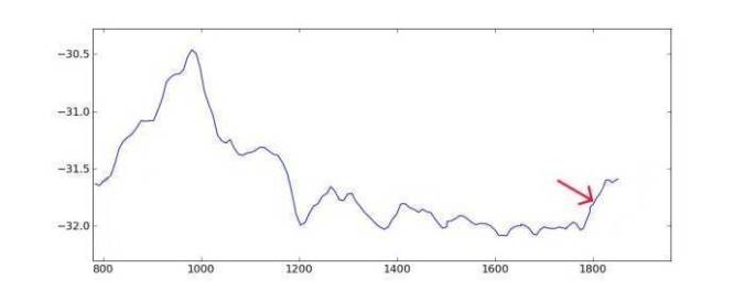
Here we see the Medieval Warm Period Circa 1000AD, when the Vikings settled Greenland, and the Little Ice Age, late 1300’s to late 1700’s.
Graph 3 – going back to 2700 BC
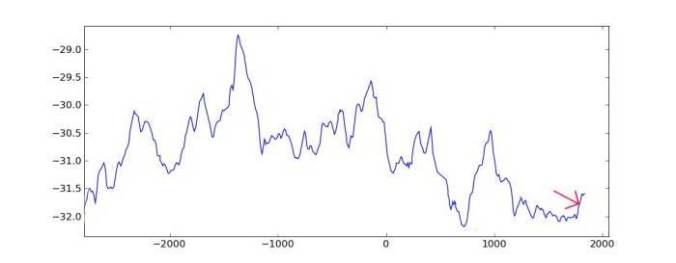
1400 BC was even warmer than Roman Warm Period and the Medieval Warm Period. And look what has happened to the ‘hockey stick!’
Graph 4 – Back to 11,000 BC, the last full-on Ice Age
You should be starting to get the picture by now, but we have two more graphs to go:
Graph 5 – 50,000 Years Ago
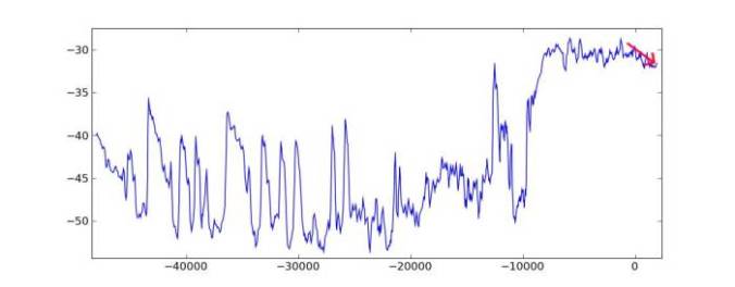
Here you can see that the ice-age is punctuated by a wildly fluctuating climate pattern with extreme swings between very cold and not so cold periods. You can bet on it that many violent weather events occurred that dwarf anything of the Holocene, which is roughly the last 1/5th of the graph above.
Graph 6 – 425,000 Years Ago [The Last Four Major Glacial Epochs] Reconstructed global temperature over the past 420,000 years based on the Vostok ice core from the Antarctica (Petit et al. 2001).
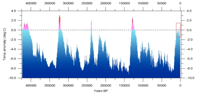
The ‘Hockey Stick’ is now an invisible blip in that little red outlined rectangle on the right, which is our current interglacial period. Previous interglacials(Red Spikes) were all warmer than our current one.
The clock is ticking…
“A model of future climate based on the observed orbital-climate relationships, but ignoring anthropogenic effects, predicts that the long-term trend over the next seven thousand years is toward extensive Northern Hemisphere glaciation.”
And this model is probably correct in ignoring anthropogenic effects because they really don’t amount to much in the long run. And I haven’t even touched on the effects from possible future volcanism which are known to have worldwide repercussions.
Thanks to Wikipedia for the Graph at the top of the post.
Thanks to Morgan Wright’s page: “Global climate change from a realistic, non-political point of view.” for the graphs 1 through 5.